Table of Contents
To close and tighten the feedback loop that connects the player with the virtual world, we need to explore what types of game mechanics can be implemented using IS, and determine the expected effect on gameplay. This section discusses different aspects of Interactive Surfaces, as well as possible applications of IS with respect to different game design objectives.
Any game has at least one interactive surface: the player's screen. Interactive surfaces move that surface from the facade of the game into the game world iself, thus removing the connotation between an out-of-game surface and the in-game reality. If our design objective is immersion, any on-screen HUD has two fundamental flaws. Firstly, as it places most if not all information on the periphery, it distracts the player view from the focal point, and closer to the border of our made-up reality. In turn, the more we overload the center of the screen with HUD elements, the more the invisible layer of out-of-game information becomes solid and tangible. Even a minimal crosshair or marker point forces the player to (mentally, not actually) focus on a plane outside, and in front of, the game. Yet, moving vital information from the periphery to the focal area is key.
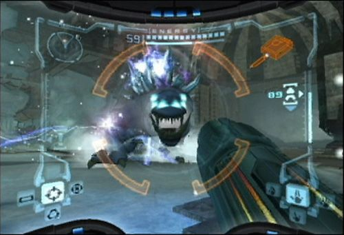
Designers such as Peter Molyneux strive to minimze or remove the HUD entirely. Military and science fiction shooters usually attempt to integrate the HUD into the fiction of the game. In the past, technical limitations forced us to implement HUD visuals as flat blits to the framebuffer. This is no longer the case, but few games seem to take advantage of this. Metroid Prime renders its heads-up view on the curved surface, to suggest it exists not on the screen but on the player's helmet visor. Halo and DOOM3 place ammo counters on the in-view weapon. If we cannot remove explicit, enumerated state from the game UI, we should at least attempt to break up the visual and aesthetical similarities to desktop metaphors. If a game's look and feel resembles that of Windows, the player is drawn back into the world outside the game. Displaying vital stats in pseudo-accurate numbers does not help immersion either.
Interactive UI elements based on keyboard and mouse cursor use within the HUD amplify this effect. Explicit inventory management on the screen or other configuration tasks that are performed as a part of the core gameplay threaten to break immersion. Weapon selection by mousewheel is immersive because it is minimal, and completely removed from the screen plane. The worst break occurs when the translucent HUD is replaced by an opaque surface cutting the player off from the game world entirely. DOOM3's PDA is a major break, and unnecessarily so considering that most of the information could have just as easily been located on GUI surfaces, and that the engine is perfectly capable of handling the PDA like an in-view tool or weapon.
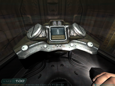
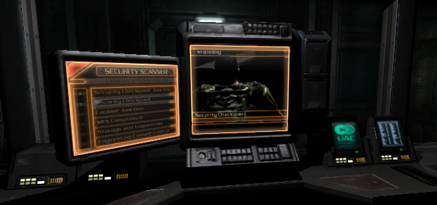
Immersion is accomplished in part by flooding our senses with just the information relevant to a task we are engaged in. The fundamental design flaw of HUD-based delivery of information is that we steer the player's eye from the in-game focus at the center to a periphery pegged to an out-of-game frame of reference. Interactive surfaces permit us to move the HUD into the game. Every in-game wall switch since Classic DOOM has accomplished this, but DOOM3's GUIs made it explicit.
As an example, consider the difference between a Half Life 1 train and the DOOM3 monorail. In HL1, the UI used to control train speed and direction is disconnected from the train itself, and visually presented in a style that ties it to the HUD of the HEV suit. In DOOM3, the monorail can be controlled by interacting with a desktop UI on a surface firmly fixed inside the game world. In-game surfaces allow us to move every UI element not related to the player's "body" into the game. Every movement mode not tied to the default avatar (e.g. vehicles), every control applied to outside entities (machinery, computer terminals) can be placed and visualized outside the HUD plane.
Ultimately, the only First Person controls that have to go through the HUD plane are those related to moving the avatar's head, feet and hands. We already try to keep the visual cues that respond to these controls in the game: in the way the view responds to mouselook, by showing perspectively modified in-view weapons, and by moving the view through the scene. On the other hand, we have yet to find intuitive ways to offer the player better control of the avatar - there is no posture control. Every verb in the players expressive vocabulary - RELOAD, USE, JUMP etc. - requires separate keys. Moving as many UI elements as possible into the game might make it easier to solve the remaining issues. Interactive surfaces make this shift economical for the developer and intuitive for the player.
Game design has to maintain a steady balance of learning vs. challenge. In addition, we face severe limitations with respect to the capabilities of input devices. To keep the game interesting, we often offer the player different avatars to choose from. Through vehicles and weapons we place new tools in the player's hands. To fit the game's fiction, different avatars can be presented as either attachments such as jetpacks, grappling hooks or parachutes, or as shells like powersuits, mechs and vehicles.
To the player, a vehicles or other avatar variation means a new UI and different movement modes to learn. Adding this variation allow us to challenge the player to switch between different sets of controls and visual cues, i.e. to use different UIs or even different UI metaphors (walk, drive, fall, fly).
Usually the game fiction implies that there is a default or primary avatar - the "real body" - and that the other modes of play are "second order" or proxy avatars, i.e. we imply the player's "real body" is used to control these shells. In reality, the player does not move virtual hands to turn a virtual steering wheel.
Different proxies have different UI requirements: a vehicle moves and turns with the player, a remote controlled sentry bot moves by itself, and stationary machinery does not move at all: the security camera or turret might turn, the crane can move within a limited space. Using Interactive Surfaces permits the designer to unify the UI structure despite these differences, making it easier for the player to handle the variation.
In reverse, the availability of proxies within the same space the player avatar is in offers choice and trade-offs: the player can opt to use a powerful gun platform instead of shooting from her own POV - she can use remote controlled proxies to cover her own back, and use her avatar as bait to lay in ambush, incidentally perceiving the attack from an out-of-body POV.
Proxy avatars like vehicles are often combined with a switch from first person to third person view (see e.g. Halo's handling of vehicle modes). If the player acquires control not of a vehicle but of an entity with constrained movements, it is often possible to continue the first person view from the player's "body" as a third person view of the secondary avatar currently under player control.
As Dreamworks' "Trespasser" illustrated, offering the player a virtual "visible hand" (especially using an in-view instead of an iconic representation) has many problems. However, the DOOM3 GUI illustrates that evocation of mouse-widget interactions within the game is intuitive, economical, and immersive (just as WIMP UI metaphors are intuitive and immersive because they evoke actual desktops and pointing fingers).
Take a valve that controls steam released into a corridor the player has to enter. Interactive Surfaces allow us to shift the interface from explicitely assigned keys to intuitive use of the pointer: we could opt to turn the mouse cursor into a hand icon hovering over the wheel, and make it intuitive to turn wheels or valves by moving this "hand" clockwise or counterclockwise across the respective surfaces. In other words, we could try context-sensitive gestures as part of the in-game interface to manipulate objects.
On the other hand, it would be ineffective to use the same approach to the steering wheel of an in-game race car or ATV. The difference is not mobility (degrees of freedom) as much as granularity (acceleration, speed, turn rates). If the vehicle was a slow-moving caterpillar, and the valve represented a highly nonlinear flow control for a nuclear chain reaction, the player would be better served with a hand icon hovering over the caterpillar level and a GUI slider for valve control.
Visual Programming solutions for scripting behaviors have been available for some time. Like VirTools or Unreal Engine 3's upcoming Kismet, they are usually tied to a specific engine technology, and might be of limited use beyond rapid prototyping. However, if such a technology is considered for production, e.g. in an effort to lower engineering costs or facilitate mod development, its usefulness for the game experience should also be considered.
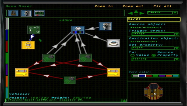
Many simulation games combine multistage puzzles with player-driven construction as the main element of the solution. Any SimAnything or RTS game is to a large extent a construction kit. Some games, such as LucasArts' DroidWorks or Cognitoy's Mindrover, have attempted to make the aspect of construction explicit. While it is possible that visual programming will never suffice to address the requirements of authoring content and engineering laws of behavior for high fidelity, deep simulation, it might well be opening a window to the game's machinery that empowers the player with direct control of connections and dependencies.
Imagine the "Half Life 1" Blast Pit puzzle mentioned earlier: using interactive surfaces with a visual programming UI, the player could review and analyze the logical connections that are involved in accomplishing her goal. The first benefit of visualizing game logic is that query and assistance are possible, and can be intergrated in the game's fiction. Moreover, it is possible to let the player succeed in solving some parts of a puzzle purely by cerebral activity, through creative use of the interactive surface (e.g. enabling bypasses and re-routing connections), while leaving some nodes of the network beyond immediate reach, so that the player has to locate them, reach them, and fix the problem on location.
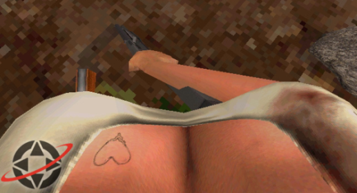
[7] The two UI components in question are the player-controlled hand/arm, and the health indicator represented as a tattoo.
