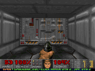
The distinction between Reactive and Interactive Surfaces is difficult to pinpoint, but it is essential [2]. In essence, an Interactive Surface is part of an man-in-the-loop situation: player action on the interactive surface will immediately induce a state change. The visual represenation of that change in turn informs (or even forces) further player action. This is not as clear-cut as it might seem: within our game simulation, the player is always in the loop with respect to one path or another. Even the most simple binary one-time switch will trigger some kind of change in the world (e.g. a door opening, monsters being released), and the player will in turn act upon these changes (but not through the same surface). The differences between reactive and interactive suraces are manifold:
Immediacy vs. Latency: feedback loops involving Interactive Surfaces have little or no latency, game response is immediate. Reactive Surfaces offer only a confirmation response, and the real effect might be delayed.
Frequency: if the player attempts control of a low latency loop with a near-continuous state space, she will continuously feed input into the system, steering it towards a desired terminal state or tracking it over time. Reactive Surfaces are typically characterised by low bandwidth: frequent player intervention is unnecessary or counterproductive.
Locality: the interactive response to players intervention can be observed close to or at the same location where the intervention is performed, ideally on the same surface. Reactive surfaces do not have to offer such convenience - distance in space translates into latency. [3]
Granularity: the state space accessible through an interactive surface is (near-)continuous, while a reactive surface usually offers a small, discrete list of states (which translate into player choices by selection), with the most minimal space offering two states, only one of which is available to player choice.
Degrees Of Freedom: the typical Reactive Surface can be represented as a serial input line. The typical Interactive Surface permits the player to manipulate multiple degrees of freedom in parallel. [4]
While there is no clear-cut way to discriminate between Reactive Surfaces and Interactive Surfaces, reviewing a given feedback loop with respect to the properties listed above helps understanding the player's situation. As a rule of thumb, an Interactive Surface will closely resemble the UI of the game itself with respect to bandwidth and degrees of freedom, while a Reactive Surface will offer a much more narrow interface to the player.
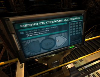
A Minimally Interactive Surfaces enables the player to control just one Degree Of Freedom (doF) at a time. Example: a one-dimensional slider to control a state variable, e.g. a temperature, light level, or position of a crane along one axis. Alternatively, pressing a button initiates steady movement in one direction, as long as the button is held down. Another button offers movement in the opposite direction. Multiple independent state variables are controlled by multiple sliders, or multiple pairs of buttons.
Note that the mouse (pointer device) on the GUI surface has two degrees of freedom (in the XY plane), plus mouse buttons, but the pointer coordinates are not used in this example. GUI switches can represent a DoF if constant engagement is needed (e.g. holding down the mouse button, or steering by bang-bang control). Note that an interactive surface can offer manipulation of several state variables, yet keep access mutually exclusive. Minimally Interactive Surfaces are easier to use, but less engaging, and might make it more time consuming or even more challenging to accomplish a given task.
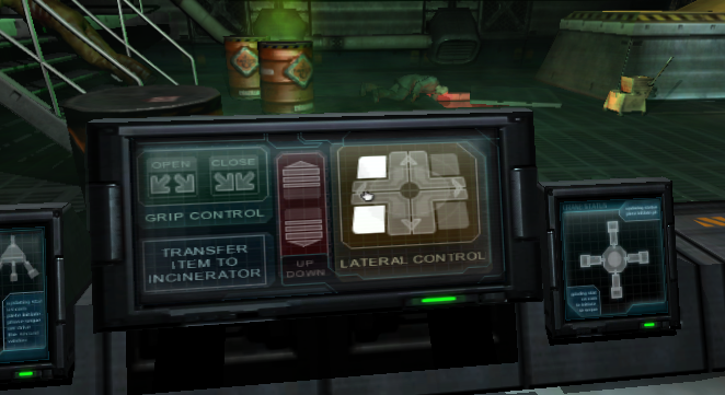
The crane example in the previous section was restricted to movement along a single rail. DOOM3's Alpha Labs also feature an H-Crane with two axis movement. For this crane, an alternative to the Minimally Interactive control of described above would use an area of the GUI surface to represent the workspace of the crane (a rectangular area). Moving the pointer within that representation provides a target for the crane, using two degrees of freedom simultaneously. In addition, the mouse wheel could be used to raise or lower the claw, and a button could be used to open and close it. The more DoF can be controlled simultaneouly, the more engaging the interface - the more interactive the surface.
In addition, the UI of a partially interactive surface might simply offer less input resolution (simple on/off toggle instead of proportional or nonlinear control of state variable) or lower output fidelity (e.g. by using an iconic instead of a view represetation).
However, there is a significant drawback of overloading the UI, namely, the player has to be able to determine which of the many possible inputs (mouse, keyboard) are needed. Different machinery (crane, train, reactor) have different requirements. The most engaging interface for any given state machine or dynamic system might be very different from the optimal interface for another class of machinery the player is asked to manipulate. The Minimally Interactive solution reduces the overload to a single input (FIRE, USE). Partially interactive solutions widen the interface at the risk over overloading the players ability to guess, learn and remember. Is there a way around this?
In a First Person game, the player will always have to master a minimal interface to control her avatar: moving in space (usually in surface contact, on planes defined by a gravity vector), as well as turning (usually aliased with LOS control). Depending on special movements (e.g. strafe, jump) and posture control (crouch), the interface for avatar control usually covers the maximum amount of degrees of freedom the game offers. There are exceptions: Quake1 offered a 4 DoF mode [5] of free movement in (water-filled) spaces different from the normal "walk" mode. Combined with USE/FIRE and other actions (weapon choice and change, reload etc.) a game presumably offers the maximum interface "width" the player is expected to handle at once.
If we consider the game's main interface to offer maximum engagement - to be fully interactive - then a Fully Interactive Surface is one that offers an interface of similar or identical complexity. The distinction between fully and partically interactive is not a clearly drawn line, but one exmaple might illustrate the difference: consider a fixed turret installation controlled through a targetting camera UI, using mouselook, vs. the Unreal Tournament Redeemer missile's secondary mode. A turret swivels and turns, but does not move in space. A good and intuitive turret UI would apply the same mouselook interface as the game, but would not offer movement commands. FIRE and reload interfaces can be re-used as is. With all movement modes missing, a turret would be controlled through a partially interactive interface. Yet, mounting the turret on a simulatenously controlled H-Crane removes that clear distinction.
On the other hand, a Redeemer missile steered by the player using a nose camera view, while offering movement along with direction control, does not offer the full range of movement control (including speed). The interface might be engaging because of the pressing need to constantly aim the steadily moving missile at a possibly moving target, but the sense of urgency results from the constraints on the interface, nots its width. Whether or not you consider a GUI controlling a Redeemer-like guided missile through nose camera mouselook fully interactive, the UI it offers to the player is definitely different from the main game UI, as the missile's "fly" mode of movement is different from the player's gravity-bound walk.
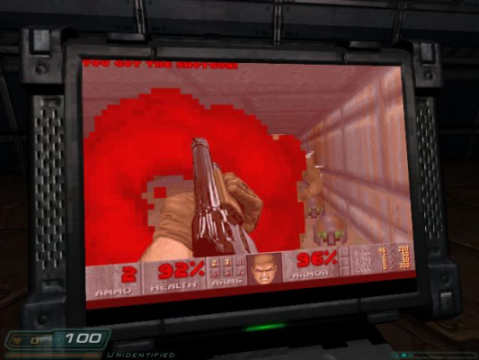
Instead of turret aiming or missile guidance, imagine the player takes control of a DOOM3 sentry bot using a GUI surface that shows the view from a camera mounted on the sentry bot's gun. Given that sentry bot and player command the same degrees of freedom with respect to movement (give or take JUMP) and carry similar weaponry, overloading the UI is not an issue: the UIs for player avatar and sentry bot are virtually identical. The player can expect (and be expected) to guess how one UI maps to the other.
One prerequisite is the use of a First Person view on the interactive surface, as using e.g. a Third Person view (e.g. nearby security cameras at fixed locations) requires changes to the UI (e.g. mouselook is no longer available). In combination with a First Person camera identical to that of the game itself, the UI for controlling e.g. a sentry bot (or any other entity subject to the same constraints as the player) becomes fully transparent. In walking up to such a GUI and activating it, the player steps "through the looking glass".
There is another necessary property: movement. A remote controlled security camera keeps the player on this side of the looking glass, while a flying camera drone allows her to step through to the other side. In other words, the interactive surface has to support some degree of freedom of movement, and the destination space has to be large enough to offer opportunity for movement.
Ideally, the transition is completely seamless, and the challenge/learning curve for the player does not exist. The experience is comparable to stepping through a see-through teleport portal: a teleportation to the location of the remote entity the player takes control of, followed by a teleportation back to the player avatar's location at a later time. While this is the most simple way of setting up a Fully Interactive Surface, avoiding all input overloading issues, it is also potentially disorienting, as the immediate (local) and proxy (remote) experience of play are identical. If our attempts to create an immersive experience are successful, the player will forget the distinction between "here" (the avatar) and "there" (the remote entity). In some cases it might be better to differentiate the experience by modifying the camera view visuals (grainy camera, infrared or light amplification view) or even modify the control's response (different sensitivity, nonlinearity) while keeping with the basic UI functionality (key bindings, mapping).
[2] In a manner of speaking, the difference between reactive and interactive defines the conflict between designer and player. In another sense, the distinction gives us an insight as to why First Person games have become increasingly stale in recent years: while we keep refining our ability to add reactive elements to our games, we have made very little progress with respect to interactive elements.
[3] The typical Classic DOOM switch does the opposite: the effect of pressing a button is usually located out of sight from the location of the button itself.
[4] The mouse-driven DOOM3 GUIs permit control of a state space only one variable at a time (e.g. with a slider input), but can support manipulation of two state variables in parallel (i.e. mouse cursor X/Y position).
[5] This mode did not offer 6 DoF because the three rotation angles were not independent - the UI used gimbal lock - and because movement in space was aligned with view.


